webかたつむり ウェブデザインを勉強中 ウェブ初心者のおぼえがき

webかたつむり

WEB制作会社のフォトグラファー

hatched shadow

f:id:ohta-felica:20161121230021p:plain

線の準備

  •  shift キーを押したまま、45度傾いた直線を描いた色を指定する。

f:id:ohta-felica:20161121233033p:plain


  • 文字の反対側にも同じく線を引く。線のバウンティンぐボックスが文字にかからないようにする。

f:id:ohta-felica:20161121233233p:plain


f:id:ohta-felica:20161121233441p:plain


f:id:ohta-felica:20161121233525p:plain

  • 2本の線を選択した状態で「ブレンド」「作成」

f:id:ohta-felica:20161121233745p:plain


f:id:ohta-felica:20161121233922p:plain

  •  線と線の間に、指定された数だけ線を引いた状態(2本の線と、その間にある線)、から1本の線が集合した状態に変換する。
  • 2本の基準となる線+間にある線、ではなくて全て等価な線にする。

f:id:ohta-felica:20161121235023p:plain

  •  見た目には変わらない、、、が線の集合体。

f:id:ohta-felica:20161121235526p:plain

  •  さらにもう一度「分割」「拡張」を行うと、線ではなく幅が1pxの長方形になる。

f:id:ohta-felica:20161121235704p:plain

  •  拡大すると分かります。
  • 幅のある線ではなく、形状にする。
  • line with weight ではなく、shapeになった。


 文字の準備

f:id:ohta-felica:20161121235918p:plain


f:id:ohta-felica:20161121235946p:plain

f:id:ohta-felica:20161122000633p:plain

  •  ☝この原則より、文字の形でマスクを作るためには、、、
  • 文字をアウトライン化する。「文字」ではなく「シェイプ」にする。
  • 複数の文字をマスクとして使用するには、文字列をアウトライン化したのちに、「複合パス」に変換しなくてなならない。
  • 「複合パス」に変換しないでクリッピングマスクを適用すると、、、

f:id:ohta-felica:20161122001102p:plain

  •  斜線が消えてしまいます。
  • どのパスがマスクなのか、イラストレーターが判断できないのでしょう、、、

f:id:ohta-felica:20161122001151p:plain

  •  文字列を複合パスに変換すると、、、

f:id:ohta-felica:20161122001336p:plain


f:id:ohta-felica:20161122001506p:plain


  •  目的の形ができました。

f:id:ohta-felica:20161122001822p:plain

  •  上にダブらせる文字に線をつけるとこんな感じ、、、

f:id:ohta-felica:20161122001931p:plain

  • おわり、、、

illustrator brush

  • パス上にパッターンを作る。
  • 「ウィンドウ」「ブラシ」

f:id:ohta-felica:20161119170248p:plain

  •  パターンにしたい図形を選択して「新規ブラシ」

f:id:ohta-felica:20161119170607p:plain

  •  「パターンブラシ」


f:id:ohta-felica:20161119170525p:plain

  •  コーナーの処理方法を設定できる模様ですが、とりあえずデフォルトの設定で、、

f:id:ohta-felica:20161119170717p:plain

  •  線を引いて、適用したいパターンを選択すると、、

f:id:ohta-felica:20161119170858p:plain

  •  パスに沿ってパターンが繰り返し現れます。色々作れそうです。

f:id:ohta-felica:20161119171229p:plain


fontello

  • フォントにしたい形を作って、「複合パス」にしてからベタ塗りにする。
  • svg」で保存。

f:id:ohta-felica:20161118223938p:plain

  • オプションは気にしないで進めて大丈夫

f:id:ohta-felica:20161118224059p:plain


Fontello - icon fonts generator

  •  「custom icons」にドラッグする。

f:id:ohta-felica:20161118224227p:plain


f:id:ohta-felica:20161118225526p:plain

 「star」は「s」で変換、「free wifi」は「w」で変換できるように設定する。

f:id:ohta-felica:20161118225930p:plain


f:id:ohta-felica:20161118230135p:plain

  •  ダウンロードする前に「font name」を設定するとすごく便利。
  • プロジェクトごとにアイコンを管理できます。

illustrator pattern

  • ctrl + c ,ctrl + f で同じ位置に重なるようにコピーができる。

f:id:ohta-felica:20161113143314p:plain

  •  下のレイヤーを黒、上のレイヤーを白、白い方は縮小して若干回転させる。
  • 線はなし、塗りだけ。
  • ctrl + g グループ化する。

f:id:ohta-felica:20161113143758p:plain

  •  拡大or 縮小 ctrl + d

f:id:ohta-felica:20161113150153p:plain


after effects 04 shortcuts mask

shortcuts


  • ctrl + alt + 「←」あるいは 「home」 タイムラインの先頭に移動
  • ctrl + alt + 「→」あるいは 「end」 タイムラインの先頭に移動
  • ctrl + shift +「 ←」 10フレーム戻る
  • ctrl + ← 1フレーム戻る
  • レイヤーを選択した状態で「i」→in点に移動
  • レイヤーを選択した状態で「o」→out点に移動


mask

  • 新規平面を背景にする。背景に楕円を描く。
  • 楕円形ツールをダブルクリックすると、フレームに内接する楕円形が描ける。

f:id:ohta-felica:20161113122349p:plain


f:id:ohta-felica:20161113122602p:plain


f:id:ohta-felica:20161113123042p:plain

  •  黒い部分→背景がない。
  • 白い部分→シェイプのパス。
  • この楕円の後ろに、もう一枚やや濃い目のグレーの平面を配置する。
  • まずは新規で平面レイヤーを作成する。

f:id:ohta-felica:20161113124806p:plain


f:id:ohta-felica:20161113124946p:plain

  •  マスクレイヤーの「反転」をチェックするとマスクが反転する。

f:id:ohta-felica:20161113125129p:plain


after effects 02 loop animation

f:id:ohta-felica:20161110232529j:plain

  •  こんな感じで並びます。

f:id:ohta-felica:20161110232638p:plain

  •  一枚の画像当たり15フレームのデュレーションにしたいからヘッドを15フレームの位置に置いて「ctrl+shift+d」そのまま「del」を押して下の状態にする。

f:id:ohta-felica:20161110232959p:plain

  •  「アニメーション」「キーフレーム補助」「シーケンスレイヤー」

f:id:ohta-felica:20161110233103p:plain

  •  綺麗に並びます。このとき、オーバーラップを設定すればスライドショーになります。

f:id:ohta-felica:20161110233829p:plain


【AE】コンポジションとは?

After Effectsでは合成やモーショングラフィックスなどを行うカンバスの事をコンポジションと言い、コンポジション上の空間補間とタイムラインの時間補間、そしてレイヤー順序を利用することでアニメーションなどの作成を実現することが出来ます。


  • 新規コンポジションを作成(設定項目は特にない。背景色をどうするかといったところ)

f:id:ohta-felica:20161109211907p:plain


f:id:ohta-felica:20161109211944p:plain


f:id:ohta-felica:20161109212047p:plain

  •  赤丸の部分を右クリックすると「レイヤー」作れる。

f:id:ohta-felica:20161109212210p:plain

  •  新規平面を作る。(背景を作る)

f:id:ohta-felica:20161109212458p:plain


f:id:ohta-felica:20161109212553p:plain

  •  文字を入力します。

f:id:ohta-felica:20161109213051p:plain

  • 左 下のアンカーポイントが拡大縮小の基準になる。

f:id:ohta-felica:20161109213501p:plain

  •  アンカーポイントの動かし方1
  • レイヤーパネルのアンカーポイントを選択、x,yを入力あるいは移動させる。

f:id:ohta-felica:20161109215627p:plain


  • アンカーポイントの動かし方2
  • 文字の上を右クリック。「トランスフォーム」「アンカーポイントをコンテンツの中央に配置」

f:id:ohta-felica:20161109215845p:plain

  •  ブラー(ぼかし)はブラーの半径「0」がシャープな状態。
  • 半径の値を大きくするとぼけていく。
  • ブラー、ボックスがレンダリングの負荷が低いみたいです。
  • ブラー、レンズは高負荷でレンダリングが遅かったです。

f:id:ohta-felica:20161109220356p:plain


f:id:ohta-felica:20161109221207p:plain

レンダリングのウィンドウが下にあるのが嫌なのでタブをドラッグしてコンポジションウィンドウの隣に置き換える。 

f:id:ohta-felica:20161109222641p:plain


f:id:ohta-felica:20161109224428p:plain


f:id:ohta-felica:20161109224517p:plain


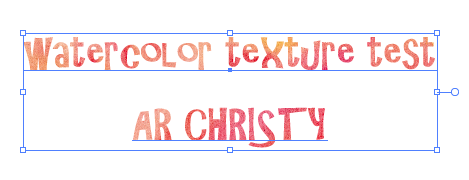
watercolor texture

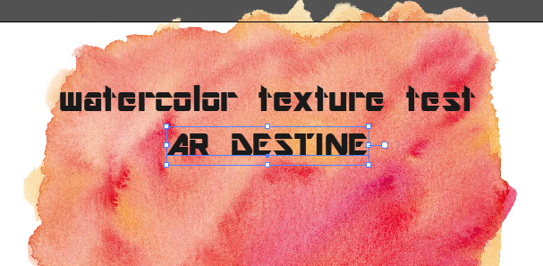
1つのパスで文字組した場合

  • illustratorで文字を組む。

  • watercolor textureの画像ファイルを配置する。

  • 画像を埋め込んで、最背面に配置する。

f:id:ohta-felica:20161108222847p:plain

f:id:ohta-felica:20161108223139p:plain


f:id:ohta-felica:20161108223327p:plain


2つ以上のパスで文字組した場合

f:id:ohta-felica:20161108224223p:plain


  • illustratorで文字を組む。

  • watercolor textureの画像ファイルを配置する。

  • 画像を埋め込んで、最背面に配置する。

  • ここまでは一緒。


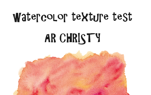
  • この先のプロセスでは(後戻りする以外に)修正が効かないのでこの状態で文字を複製しておく。アウトライン化すると後戻りができない。

f:id:ohta-felica:20161108224741p:plain

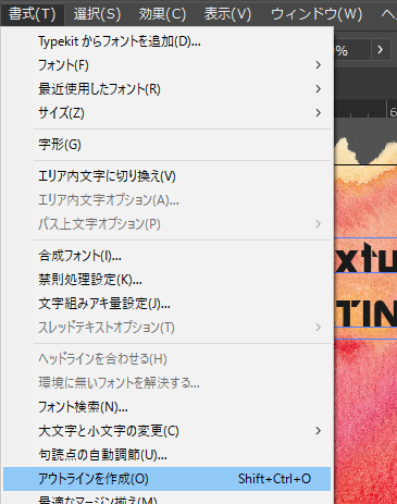
  • 「書式」「アウトラインを作成」☞テキストをパスに変換
  • 「オブジェクト」「複合パス」「作成」☞2つのパスを1つにまとめる。
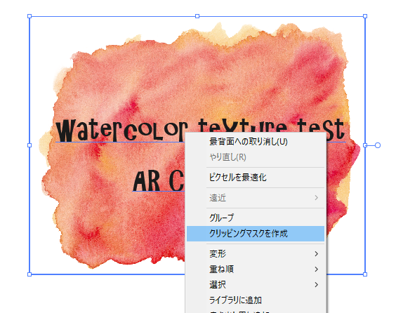
  • なぜならば、2つのパスをまとめて、同じ背景でマスクできないから。
  • パス一つに対してマスクするための背景が必要になる。
  • あとは背景を手前にある複合パスでマスクすればよい。

f:id:ohta-felica:20161108225306p:plain


The 3 methods for creating watercolor typography in Illustrator
1. Clipping Masks (single shapes or letters, or text typed together)
2. Pattern Swatches (can be applied to any element or typography, no matter how many)
3. Compound Paths (Use as a substitute for swatches; allows you to use one texture across multiple elements and typography. Text becomes uneditable.)
Whenever you create watercolor typography in Illustrator, keep these in mind:

Only a clipping mask is required if your text is created together.If text isn’t typed out together, you’ll need to expand it, unite it, and create a compound path before applying your clipping mask. Your text will be uneditable after expanding it, so if you need to keep it editable, either save a ‘raw’ file before expanding, keep all of your text typed out together, or use a pattern swatch.Compound paths allow Illustrator to consider multiple elements ‘one’ before a mask is applied. This will keep your texture spread across all elements instead of only one. Simply grouping your elements together is not enough.To release a clipping mask, select your typography, right click > release clipping mask


円周上に並べる

f:id:ohta-felica:20161107233237p:plain

  •  円周上に並べたいものを円の直径の延長線上に配置する。

f:id:ohta-felica:20161107233457p:plain

  1.  回転させるものを選択
  2. アウトライン化する。(中心を視認しやすくするため)
  3. 「r(回転ツール)」
  4. 回転軸のカーソルを「alt」キーを押しながら円の中心(回転軸)に持ってくる。
  5. ダイアログボックスに条件を入力する。
  6. ctrl+dでコピーを繰り返す。
  7. 中心の円を消す。

f:id:ohta-felica:20161107234809p:plain